
If you are looking at 70's classic rock album covers, the first thing to notice is not just whether the artwork is famous, but why it still works at LP size. The strongest covers gave the music a visual identity, rewarded close looking, and often turned the record sleeve into part of the experience. For a casual fan, the key is the image; for a vinyl collector, the packaging details can matter just as much as the record inside.
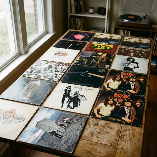
Visual styles that defined 1970s rock covers
Rock sleeves in the 1970s were not locked into one look. A buyer could flip through a record bin and move from a stark symbol to a theatrical portrait, then to a fantasy landscape or a sleeve that looked more like a strange photograph than a band promotion.
Minimalist symbols
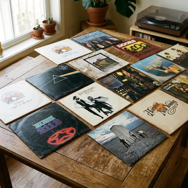
Minimalist covers worked because they made one image carry the whole album. Pink Floyd's The Dark Side of the Moon is the obvious benchmark: a black background, a prism, and a line of color that almost anyone can recognize from memory.
For a new listener, this kind of cover gives a fast signal: serious, modern, slightly mysterious. For a designer or collector, the lesson is different. A simple sleeve only becomes iconic when the symbol feels inseparable from the sound, not when it is merely clean.
Glam rock portraits
Glam rock used the cover as a performance space. David Bowie's Aladdin Sane did not just show Bowie; it created a version of Bowie that looked theatrical, alien, elegant, and emotionally exposed at the same time.
These portraits matter because glam depended on transformation. Makeup, pose, color, and styling were not decorative extras. They told the buyer that the artist was offering a world, not just a set of songs.
Surreal photography
Surreal photography gave 1970s rock covers their strange, physical magic. Studios such as Hipgnosis often built or staged scenes in the real world, which is why many of their images still feel more convincing than later digital fantasy.
Fantasy illustration
Fantasy illustration suited progressive rock because it matched music that wanted to feel expansive. Roger Dean's work for Yes created floating islands, organic shapes, and dreamlike landscapes that made the sleeve feel like a doorway into another place.
This style is especially rewarding on vinyl. A phone screen reduces a fantasy cover to color and shape, but an LP lets the small details, invented architecture, and printed textures become part of the listening ritual.
Intimate artist photography
Some of the decade's strongest covers avoided spectacle altogether. Records such as Carole King's Tapestry and Joni Mitchell's Blue used closeness, natural light, and emotional directness instead of concept-heavy staging.
Futuristic graphic design
Futuristic design showed up through bright color, sharp geometry, science-fiction imagery, and polished graphic forms. Boston's debut and several Electric Light Orchestra sleeves used spacecraft, glow, symmetry, and scale to suggest ambition before the record even played.
This is the style to look at when an album wants to feel big, engineered, and forward-looking. It may not always carry the emotional mystery of Hipgnosis or the intimacy of a singer-songwriter portrait, but it is very effective at selling momentum and escape.
Stories behind famous 1970s album covers
The most memorable 1970s sleeves usually have two stories: the image people remember, and the practical decision that made it work. Some covers were designed to be instantly readable. Others became famous because they were difficult, expensive, provocative, or unusually hands-on.
The Dark Side of the Moon and its prism
Pink Floyd's The Dark Side of the Moon cover, designed by Hipgnosis with artwork by George Hardie, is probably the clearest example of an image becoming larger than the album itself. The prism is scientific, elegant, and easy to reproduce, but it also fits the record's themes of pressure, time, perception, and mental strain.
Sticky Fingers and its working zipper
The Rolling Stones' Sticky Fingers turned the album sleeve into a physical joke and a provocation. Andy Warhol's concept, produced with Craig Braun, used a close-up image of jeans with a real zipper that could be pulled down.
The idea was brilliant, but not tidy. The zipper made the sleeve more expensive and could damage nearby records if copies were stacked or shipped carelessly. That trade-off is exactly why the cover matters: it proves how far 1970s rock packaging could go when the object itself became part of the attitude.
Aladdin Sane and Bowie's lightning-bolt portrait
David Bowie's Aladdin Sane cover is a portrait, but it behaves more like a logo, a costume, and a myth all at once. Brian Duffy's photograph and Pierre Laroche's lightning-bolt makeup created one of the decade's most copied music images.
The cover works because it is not only flamboyant. Bowie's closed eyes give the image a strange vulnerability, so the sleeve feels both theatrical and human. That balance keeps it from becoming just a fashion shot.
Who's Next and its concrete monolith
The cover of The Who's Who's Next, photographed by Ethan Russell, places the band near a concrete monolith on a slag heap, with the suggestion that they have just urinated on it. The joke points toward 2001: A Space Odyssey, then drags that grand symbol back into rough rock-and-roll territory.
Rumours and its staged band portrait
Fleetwood Mac's Rumours uses a staged portrait rather than a literal story. Mick Fleetwood and Stevie Nicks appear in a pose that feels theatrical, private, and slightly unstable, which suits an album built from romantic collapse and band tension.
The cover is especially strong because it does not over-explain the drama. It gives the listener a mood to carry into the songs, then lets the music reveal the emotional damage.
Breakfast in America and its New York diner scene
Supertramp's Breakfast in America is one of the decade's sharpest visual jokes. The cover turns New York into a diner-table skyline, with breakfast items standing in for buildings and a waitress posed like the Statue of Liberty.
For someone browsing a record shop, the concept is readable in seconds. For someone holding the LP at home, the details keep paying off. That combination of instant joke and close-viewing reward is harder to achieve than it looks.
Designers who shaped 1970s rock artwork
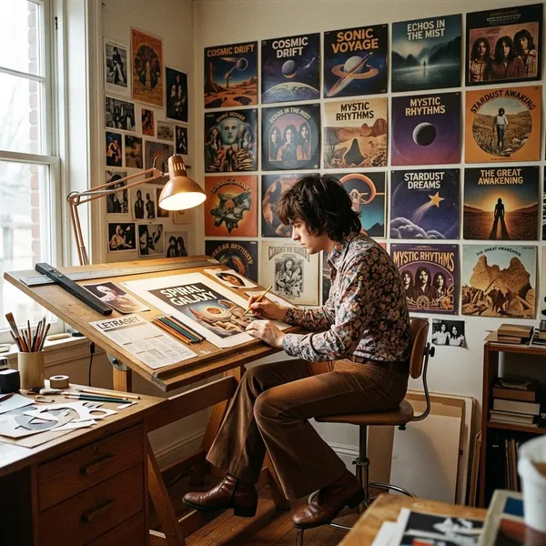
Many famous 1970s covers are tied to musicians, but the visual language came from designers, photographers, illustrators, makeup artists, and production specialists. Knowing their names makes the decade easier to understand because you start seeing patterns across albums that may sound very different.
Hipgnosis and Storm Thorgerson
Hipgnosis, co-founded by Storm Thorgerson and Aubrey Powell, shaped the look of conceptual rock sleeves more than almost any other studio of the period. Their work for Pink Floyd, Led Zeppelin, 10cc, Genesis, and Peter Gabriel often relied on staged scenes, visual puzzles, and metaphor rather than straightforward band photography.
- Look for tension: the image often feels real and impossible at the same time.
- Look for restraint: the cover usually suggests an idea instead of explaining it.
- Look for physical craft: many effects came from staging, location work, collage, or print manipulation.
Andy Warhol and Craig Braun
Andy Warhol brought pop-art nerve and celebrity-world cool to rock packaging, but Craig Braun's production role was just as important on Sticky Fingers. A provocative idea only becomes a legendary sleeve if someone can turn it into a manufactured object.
Their collaboration blurred the line between album cover, art object, and commercial product. If you are judging this sleeve as a collector, the zipper is not a bonus detail; it is central to the design's meaning and condition.
Brian Duffy and Pierre Laroche
Brian Duffy and Pierre Laroche show how one iconic image can depend on several creative decisions landing at once. Duffy controlled the portrait's graphic clarity, while Laroche's lightning-bolt makeup gave Aladdin Sane its unforgettable visual hook.
Roger Dean
Roger Dean gave progressive rock a visual universe. His work with Yes used floating landscapes, invented forms, and organic architecture to make albums feel connected across sleeves, logos, stage design, and merchandise.
For a design student, Dean's covers are worth studying as world-building. For a vinyl buyer, original large-format sleeves matter because the scale and color are part of the experience; a small reproduction loses much of the atmosphere.
Peter Saville
Peter Saville arrived near the end of the decade, but his work on Joy Division's Unknown Pleasures pointed toward a cooler, more restrained design future. The pulsar-wave image feels scientific and emotionally intense without needing a portrait or a crowded composition.
His influence matters because it changed what a rock sleeve could signal. It could be spare, intellectual, and still deeply charged.
Album covers that changed vinyl packaging
Some 1970s covers changed expectations because they were not just images printed on cardboard. They moved, opened, revealed, scratched, hid, or changed depending on the copy you bought. That physical side is one of the main reasons vinyl-era artwork still feels different from digital artwork.
Led Zeppelin III with its rotating wheel
Led Zeppelin III, designed by Zacron, used die-cut holes and a rotating wheel that changed the images visible through the front cover. It was playful, busy, and slightly chaotic, which suited an album that moved between heavy rock and more acoustic material.
Sticky Fingers with its metal zipper
Sticky Fingers is the packaging idea most people remember because the zipper was real. It made the sleeve tactile, funny, and confrontational, but it also created storage problems.
If you want a copy for display, the zipper and front condition will matter most. If you want a clean play copy, also check whether the zipper has caused pressure marks or wear to the record or neighboring sleeves.
Physical Graffiti with its die-cut windows
Led Zeppelin's Physical Graffiti used a New York building façade with die-cut windows that revealed different images from the inner sleeves. The outer cover became a frame rather than a fixed picture.
- Check the window edges: torn die-cuts are common on handled copies.
- Check the inner sleeves: the changing effect depends on the correct inner artwork.
- Check reissues carefully: some versions simplify the original sense of depth.
Some Girls with its changing portrait sleeve
The Rolling Stones' Some Girls used cut-out windows and portrait imagery inspired by beauty advertising, letting different faces appear through the sleeve. It was playful, abrasive, and designed to feel a little unstable.
The cover also ran into legal complaints and had to be revised, which is why early versions attract extra attention. Anyone buying a copy should identify the specific pressing rather than assuming all sleeves show the same artwork.
In Through the Out Door with its hidden cover variants
Led Zeppelin's In Through the Out Door turned packaging into a small collecting puzzle. It appeared in multiple cover variants with different viewpoints of the same barroom scene, came in a brown paper outer wrapper, and included inner artwork designed to reveal color when moistened.
Conclusion
The best 1970s rock covers still hold up because they made the album feel bigger than the record alone: a symbol to remember, a face to believe in, a scene to decode, or a sleeve to handle carefully. If you are exploring this era now, start with the image that grabs you, then look at the designer, the printing, and the packaging choices that made it work. That is where these covers stop being nostalgic decoration and become a real part of rock history.