
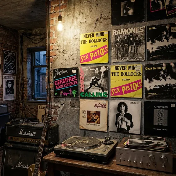
The most memorable classic punk rock album covers are not iconic because they look polished; they are iconic because they tell you what the record is before you hear it. The best ones use rough photos, borrowed media language, stark contrast, political discomfort, horror symbols, or a single unforgettable logo to make the music feel immediate.
What makes punk album art distinctive
Punk cover art usually works fastest when it gives you one strong signal: attitude, danger, satire, alienation, or scene identity. If you are looking at a sleeve and wondering why it matters, start with three checks: what the image makes you feel, how handmade or controlled the design looks, and whether the cover points inward to the band or outward to the world around them.
- Check the production style first: grain, photocopy texture, rough type, and uneven collage edges often support the message.
- Look for the scene: New York realism, British graphic provocation, hardcore monochrome, and horror punk all speak differently.
- Ask what is being rejected: celebrity glamour, state power, commercial polish, boredom, or respectability.
- Do not confuse simple with lazy: many famous sleeves are minimal because the image is doing one job extremely well.
Raw street photography
Raw street photography gave punk a believable face. Brick walls, sidewalks, clubs, alleys, cheap clothes, and blank expressions made the music feel local instead of manufactured. The Ramones debut cover is the cleanest example: four figures, one wall, no fantasy, no extra explanation.
Cut-and-paste typography
Cut-and-paste typography made punk feel like a message assembled in a hurry from newspapers, flyers, and stolen media scraps. It was cheap to make, easy to reproduce, and visually aggressive enough to suit records that wanted to interrupt polite culture.
Stark black-and-white artwork
Black-and-white punk artwork often works because it removes comfort. Without bright color, the eye goes straight to expression, gesture, shadow, line, and tension. That was useful for hardcore, where the music itself became faster, harder, and less interested in style for its own sake.
Political satire and shock imagery
Political punk covers often point away from the band and toward the society being criticized. Police lines, war imagery, propaganda references, tabloid fragments, or grotesque collage can make the sleeve feel less like packaging and more like an accusation.
- Satire works when the image exposes hypocrisy or media absurdity.
- Shock works when it forces discomfort instead of offering easy style.
- Weak shock feels empty when it only tries to offend without a clear target.
Horror-inspired visuals
Horror gave punk a darker, more theatrical vocabulary. Skulls, monsters, graveyards, B-movie references, and pulp illustration let bands create a world that fans could recognize instantly.
The Misfits show why this matters. Their imagery does not just decorate the records; it turns the band into a repeatable visual identity. If you are discovering punk through shirts, patches, or posters rather than record bins, horror symbols can be the first doorway into the music.
Memorable mascots and logos
Some punk covers became iconic because the symbol could travel. The Ramones seal, Black Flag bars, and Misfits skull all work on sleeves, shirts, stickers, patches, and walls. They are simple enough to reproduce and strong enough to identify a scene from across a room.
Stories behind the most famous covers
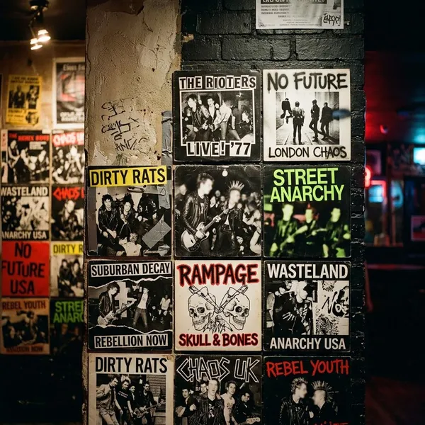
The most famous punk sleeves tend to have one thing in common: they reduce a band, a scene, or a conflict to a single image that still reads quickly decades later. Some are staged, some are accidental, and some are carefully designed acts of graphic provocation.
Ramones and the chain-link fence portrait
Roberta Bayley's cover photograph for the Ramones debut turned a simple street portrait into a punk blueprint. The brick wall, chain-link fence, leather jackets, ripped jeans, sneakers, and unsmiling lineup made the band look both ordinary and untouchable.
The image works because nothing gets in the way. No dramatic lighting, no elaborate pose, no expensive set. For a young band, it showed that identity could come from posture and confidence rather than budget. For listeners, it made punk look reachable: four people on a city street, not distant rock stars.
Never Mind the Bollocks and its ransom-note design
Jamie Reid's cover for Never Mind the Bollocks, Here's the Sex Pistols is punk graphics at full volume. The pink and yellow blocks are loud before the title is even read, and the cut-out lettering turns the sleeve into something closer to a threat, a poster, or a public interruption.
Its influence comes from how precisely it refuses good taste. The cover does not politely represent rebellion; it performs it through color, type, and visual disorder. That is why designers still reach for similar lettering when they want to suggest protest, danger, or anti-authority energy.
Fresh Fruit and its confrontational news image
Fresh Fruit for Rotting Vegetables uses public unrest as its visual entry point rather than presenting Dead Kennedys as stylish figures. That choice fits a band whose songs attacked political hypocrisy, media spectacle, and state violence.
The cover is useful to read as a warning sign. It tells the listener not to expect escapism or cool detachment. If a Ramones-style portrait says "this is the band," this sleeve says "this is the world the band is responding to."
How punk cover styles changed
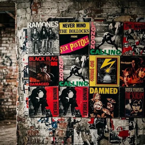
Punk did not settle into one fixed look. The visual style changed with city, decade, subgenre, budget, and audience. A 1976 New York sleeve usually asks to be read differently from a 1983 hardcore record or a horror punk release built around a recurring mascot.
Street realism shaped early New York punk
Early New York punk often looked cool because it looked close to real life. Covers tied to CBGB and the downtown scene used photography to document people, clothes, streets, and body language without making everything feel staged for mass appeal.
For someone new to the genre, this is a good place to start. These sleeves show punk before it became a set of instantly recognizable design clichés. They feel like documents of a social world: art school, street style, cheap spaces, and bands building identity from what was already around them.
Bright provocation defined British punk
British punk pushed harder into graphic confrontation. Bold color blocks, torn typography, tabloid language, and collage made sleeves feel like attacks on public taste. The design often borrowed the look of mass media and turned it against authority, advertising, and respectability.
Monochrome art became a hardcore staple
Hardcore stripped punk design down. Black-and-white photos, rough drawings, photocopied flyers, and severe layouts matched music that was faster, shorter, and more physically direct.
| When you see this | It usually suggests |
|---|---|
| Harsh black-and-white contrast | Intensity, urgency, low tolerance for polish |
| Photocopy texture | DIY circulation, small-label economics, flyer culture |
| Minimal layout | Focus on impact rather than decoration |
Horror imagery gave bands a darker identity
Horror punk created a different kind of recognition. Instead of relying on city realism or political collage, bands could use skulls, ghouls, monsters, and old movie references to build a visual world.
This worked especially well for long-term fan identity. A horror symbol can live on a shirt, patch, bedroom wall, or flyer long after the listener first finds the record. The cover becomes part of a larger atmosphere, not just a one-time image.
Cartoons made punk branding more approachable
Cartoons gave some punk bands a friendlier entry point without removing the edge. Pop-punk, skate punk, and melodic hardcore often used simple characters, comic-style drawings, and mascots that were easy for fans to copy or wear.
The Descendents' Milo character is a strong example because it feels personal rather than slick. For a younger listener, that kind of image can make punk less intimidating. For the band, it creates continuity across releases without needing the same photo style every time.
Artists behind classic punk cover design
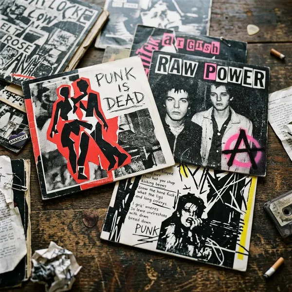
The people behind these sleeves shaped punk as much as many musicians did. Photographers, illustrators, and designers decided how the bands would be seen in record shops, zines, posters, and later on shirts and walls.
Roberta Bayley and Arturo Vega
Roberta Bayley and Arturo Vega gave the Ramones two sides of one identity. Bayley's photography made the band feel real, local, and perfectly composed without looking overproduced. Vega's seal-style logo made them portable, repeatable, and instantly recognizable.
That combination is one reason the Ramones remain so visually coherent. A band portrait told you how they stood in the world; a logo let fans carry that identity into the street.
Jamie Reid
Jamie Reid's work with the Sex Pistols made British punk look like a graphic attack. His collage, broken typography, and anti-establishment imagery drew from radical politics, underground publishing, and media disruption.
His designs are easy to imitate badly because the surface is so famous. The useful lesson is not "use ransom-note letters." It is that Reid matched form to attitude: the sleeve looked unstable because the message was meant to challenge official culture.
Raymond Pettibon
Raymond Pettibon gave hardcore a visual language of pressure, damage, and uneasy thought. His work around Black Flag was not only aggressive; it was psychologically charged, often mixing comic-like drawing with darker literary and emotional undertones.
That is why Damaged feels more lasting than a simple tough image. It suggests an internal break, not just outward violence. Many later underground artists borrowed that severity because it could hit fast while still leaving something unresolved.
Gee Vaucher
Gee Vaucher's work with Crass pushed punk design into political collage with unusual depth. Her images brought together war, surveillance, consumer culture, religion, state power, and domestic unease in compositions that could be read quickly or studied slowly.
For anyone who assumes punk graphics are only rough and loud, Vaucher is the correction. Her work shows how punk art can be disciplined, layered, and intellectually sharp while still refusing comfort.
Conclusion
Classic punk sleeves last because they make strong decisions: one hard photograph, one abrasive type treatment, one political target, one brutal contrast, or one symbol that fans can carry with them. If you want to understand why a cover matters, look first at what it refuses to be polished, neutral, glamorous, respectable, or safe, then notice how that refusal matches the sound of the record.